Monday, 30 January 2012

30TH JAN 2012

TROPE 
"a re-occuring element or convention which has formed over many years. "


MEME
 "a cultural unit that gives us information about something and spreads from people to people."


POP TROPES
  • really fashionable
  • looks like having loads of fun
  • usually singing about the opposite sex
  • smiling
  • girly
  • attractive people
  • bright colours
  • appear perfect
  • idolised by all ages
  • can be liked by all ages
  • in bands often members where the same things in different colours, or each member given a colour and wear their colour in different items of clothing 

The tropes of anything is important in giving a genre an identity and giving it its memes. Memes of a particular industry change over time depending on the themes the genre portray. These are changed by different people developing different fashions and trends depending on the history of that genre. 
Pop music derived from rock and roll in the 1950s. There are few incidents in the history of pop music however many of the charts is dominated by pop artists and millions of copies of there singles and albums have been sold around the world. 
Memes of pop music at the moment are the over the top outfits and music videos. 


HIP-HOP/RAP TROPES
  • usually quite sexual
  • sometimes a lot of tattoos on the artist
  • often collaborate with other artists 
  • don't tend to wear generically glamourous clothing
  • always appear quite rough and 'from the hood'
  • have a lot  of skin showing
  • will often wear a lot of jewellery 


HEAVY METAL TROPES
  • aggressive 
  • angry
  • usually singing about something they hate or are passionate about
  • wear a lot of leather and chains
  • usually have long, dark hair
  • big part of song time often given to an instrumental 

Friday, 27 January 2012

27TH JAN 2012

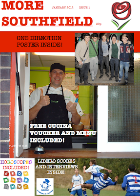
DRAFT SCHOOL MAGAZINE COVER


27TH JAN 2012

DIFFERENT MUSIC GENRES


27TH JAN 2012

"The ideology of the music will affect the design. A pop magazine may, for example, use bright primary and pastel colours and use smiling pop stars. Rock magazines will use clashing and aggressive fonts and colours and have grimacing bands, sometimes making rude gestures."
                - Mr Swain

27TH JAN 2012

DRAFT CONTENTS


After reviewing the feedback of my focus group I picked out things that I thought were wanted by all, and things that were generic of a magazine and put them into a contents page for a mock school magazine. I have also done a Cover page which I will be uploading shortly. I think the colours, font and images will be liked by all, it is easy to interpret and contains the majority of what all age groups wanted. 

Friday, 20 January 2012

20TH JAN 2012

Today as part of our research into our preliminary project we got three different focus groups in to see what they would want in a school magazine.


YEAR 7

  • particularly wanted celebrities on the cover, for example all agreed on 'One Direction' and then included inside, pictures and interviews
  • they wanted feedback from council meetings
  • upcoming events in the school and local areas
  • achievements from things like sport
  • a free gift for example house points, vouchers for the canteen
  • a timetable of revision sessions
  • horoscopes
  • games
  • agony aunt
  • competitions 
  • a new magazine once a month
  • the canteen menu and an opportunity to write in with new suggestions
  • the colours to be seasonal
STAFF
  • they wanted information about students opinions and things they want and have created
  • house reports
  • the magazine to be published once a short term
  • theme each addition
  • teacher interviews
  • a problem page
  • the school colours to be the main colour theme
  • hard hitting stories about the school area
  • education stories, things in the news that will be affecting the school
  • polls and opinions
  • light hearted stories
  • teacher comic strip
  • letters page
  • events upcoming in the school and local area
  • house colours down the side of the page
  • a lower and upper school section
MALE SIXTH FORM STUDENTS
  • in the words of the sixth formers a "fit bird" on the cover
  • attractive people on the front
  • a fashion page
  • gossip column 
  • bold colours, but not the school colours
  • to be published once a fortnight
  • whats on in the canteen and again offer vouchers
  • football scores and reviews from the school team
  • a comment page
  • agony aunt, eg Dear Derdrie 
  • a cartoon with a moral 
  • events coming up in the school and local area
  • music/game/film reviews
  • discounts
The points in bold are the ones all focus groups suggested and so are the things that should most probably be included in the magazine.

18TH JAN 2011

What Makes a Good School Magazine.

There are various aspects of a magazine that make it a good, appealing product. As an exercise before making our preliminary product we need to look at good and bad examples.  

The cover to the left, I feel, is a bad example. You should never really use more than two colours, and not only has this cover used a variety of different colours the colours also clash. The over use of sell lines makes it seem amature and immature and by having an inconsistent font it creates a confusing affect and will turn off the consumer. The cover above, "Parent And School" I like. The image looks professional and although they have used three colours, these are consistently used throughout the magazine. However I feel the sell lines at the bottom ruin the cover because they've deliberately put them in a black box which is too over powering and could have been done in a much more affective way. 

The cover to the right has one of the main generics of any media product. The people on the front are beautiful. Although the cover does appear almost boring an empty, because the two people in the picture would be thought by many to be good looking, more people will be drawn to it. 


Monday, 16 January 2012

16TH JAN 2012

Today was our first day blogging. 
We looked at what is and isn't a good magazine cover, and then made a note of everything we could see in the frame. 


http://www.kehs.org.uk/UserFiles/File/HP_AUT_WINT_09_lowres.pdf


When deconstructing this example I found of a good magazine cover we found characteristics that all successful magazines had:

  • a clear bold title at the top - the word Profile in the title is the second word but the only word in bold. Therefore making the viewer focus upon this word. If the word High was in bold then it could bring people to think of drugs. 
  • the date and title of the school included with the magazine title however in a smaller font - this is because it is still important but not as important to the consumer as the recognisable title will be. 
  • a rhetorical question - this is also in quite a large font. This aspect of the cover is important because it is what draws the buyer in to being interested in the magazine. If they don't think that there is anything of interest in the magazine then they aren't going to buy it.
  • the image covers the whole page with the font on top of the picture - this is often done to show the main story of the magazine and create a colour theme. 
  • the font is consistant showing a mature approach to the magazine as apposed to a amature approach


An example of a poor attempt at a magazine is the magazine Crazy Chillin' from an english school in Germany.


This isn't a good magazine because of various reasons:

  • the colour theme of the colour, not only being different to the rest of the magazine but also being yellow. The colour yellow has been proven to be a colour to avoid because it makes it harder to view. 
  • the font is inconsistant and therefore makes it seem amature 
  • by having an intensional italic in the title of the school for the word the it makes the magazine seem even more amature, as though they are just trying to include loads of different effects. 
  • the title of the magazine is in a special effect font. Although this may have been done to make the consumer think it is "cool" it just makes it confusing to read and should probably have been left in a clear bold font. 
The contents page of any magazine is important and although it does benefit this magazine by having one, because it has been done in such a way that looks boring childish and basic, it means the consumer is just going to be even less interested in the magazine. 
  • the font is inconsistant again, so almost confuses the eye of the observer
  • the colour, although has changed from the original yellow is now just all white and so adds to the boring theme the magazine will now hold
  • although it has many different headings and subjects within the magazine, as the saying goes "its quality not quantity" and just from reading the page titles, it becomes very repetitive and basic. 
  • no colours or images have been used to draw the consumer in so it is likely they won't want to read on. 


All magazines should contain a double page spread. This is just usually to show one of the main stories of the magazine or one of the facts they feel will be most appealing to the reader. 


This double page spread is not only bland, but inconsistant. The article is an interview with a teacher. However the font used is continually changing, there isn't a consistancy with capital letters and full stops.